Another contrast of these two videos is the use of stationary cinematography of my video (with maybe a few exceptions, using hand held camera) with use of pans and tilts versus the constant hand held cinematography to provoke mobile framing. This is due to the dependency of movement in the At Home video by cinematography to denote the notion of journeying and adventure, whereas my video does this through editing techniques and composition in the shot of the characters; the triangle formation and the number three is prominent in the video to represent the 'love triangle'.
Another inspired technique taken from an existing media text is the editing technique known as 'split screening'. Split screening requires great precision and can express multiple, contrasting shots within one scene or shot. Radiohead's video for the single 'Street Spirit (Fade Out)' uses this technique throughout, using slow motion split screens within a shot of real-time motion to create a contrasting effect of time, creating an obscuring effect. This coincides also with the abstract, obscure design on my digipak.

 Another difficult factor with the split screening was the slow motion. Due to the editing machine that functioned Adobe Premiere Pro (the industry standard software used to edit the video) having specific settings to the frame rating of the video, and the precise frame rating that the video had to be - the video I produced was set at 25 fps - then obscuring the motion meant altering the frame rate. This difficulty can be seen in the slow motion split screen of Sami running as this is slightly jittery in the motion, as opposed to the real media text, Radiohead's video, which would have used a camera and software specifically designed for capturing slow motion images with high frame rates.
Initially, the dissolving editing technique was also taken from the Street Spirit video, where she shot dissolves in multiple layers of a close up of the front man Thom Yorke's face (3.28 - 3.36).
Here is the 'Rough Cut' copy of the imitation of that dissolve transition editing:
Here is the 'Rough Cut' copy of the imitation of that dissolve transition editing:
A decision was made to remove this from the final edit as the technique was too sharp in the edits rather than the coherent and flowing transitions of the Radiohead video. Instead,this sequence was replaced by a less intricate yet still effecting lip-syncing sequence by Sam, also including the motif of the strobe lighting (2.27 - 2.35). This is an example of how replicating, or attempting to replicate a professional piece of editing can result in failure, yet then develop an equally as effective editing sequence that still uses the foundation of the existing media text.
Ancillary Texts: Digipak


Ancillary Texts: Digipak


This is my chosen geometric digipak design next to some real media texts that I showed in my research. In terms of graphology and organisation of the page with reference to media language, the conventional artwork as well as the title of the album and the artist can be seen, which is conventionally speaking, the only text on the cover. The prominence of colour and bright coloured artwork is also conventional of artwork of this specific genre - with the exception of the Caribou album pictured in black and white. However, geometric wasn't the only stylistic that I chose for visual inspiration, I combined this basic geometric with intricate textures to create a marbled effect embedded within the triangular shapes. This denotes the intricate interior, despite the basic exterior: similarly mirroring the emotions represented in the music videos. This an example of how artwork and graphics match a synergistic result, also with the shape of triangles also present in the video as well as this digipak. This is my challenging the convention by using a hybrid method of more than one graphic style - basic as well as intricate - to denote the meaning of the music video.
Ancillary Texts: Magazine Advert
 I chose this image because Sam is not looking directly at the camera, yet looking in the general direction of the camera. This evokes an idea that Sam is ignoring or looking past the audience, retaining within the diegesis of the video and this advert; breaking realism can undermine the advert or look too 'cheesy', trying too had to connect with the audience. Additionally, the light on Sam's face is even and doesn't have too many shadows obstructing his facial features. One problematic, yet minor feature of this image is the red eye effect created on Sam's eyes due to the conflicting light from the flash and from the lamp i used. This was, fortunately, easily deleted with use of the Red-eye Removal Tool on Photoshop. The framing, however, is slightly obscured, with Sam only partially filling the frame, yet I always had the intention of only using Sam's outline: the purpose of the white backdrop made editing and cutting Sam from the fame much easier, as well as giving a reflective surface to shine light back on Sam. This would then make it an ideal image to place on the page to create an advert. With consideration of mise-en-scene of the video, I retained the colour scheme of thorough blue colour, however, upon reflection, this was completely redundant anyway as I only used the facial shot of Sam; I should have just taken a clse up of Sam's face with lighting on Sam's face, where I would not have needed to zoom and enhance the face cut out I did on Photoshop which actually reduces the quality of the image.
Research provided a basis for a successful final product I beleive, yet obviously with some pit-falls. Initially, strucutring a first draft of the advert created using the textures considered for the digipak.
The image was too white, with too much blank space; which did on conform to the conventional display of a magazine advert which have the purpose to utilise page space and catch the readers eye; which I felt this original draft did not. However, I did wish to transfer the traingular shapes, to create a true tessellation pattern. This would fill the empty space on the page and create a more colourful and attention provoking text. Additionally, the opacity and light exposure/contrast on Sam's face after editing and placement on the page was too light, creating an almost blurred effect which I did not want; I only intended to layer the image, duplicated upon another. The syntax of the advert and the graphological placement of each banner (seen at bottom and top of the advert) was satisfactory and I thought no need to alter this structure.
This is an example of how initial drafting is ideal when creating a visual text, where I can easily reflect upon something I dont think satisfactory and re-do the text or make some sort of alterations to the text. With all the self-critisism I gave myself for my first advert; as well as some from peers who have told me about the adverts 'blankness', I could make ammendments to improve this speicfic auxiliary text to accompany my music video.
The process I went through to ammend my initial advert was still using the structure of the draft, yet visually make the advert more appealing to the audiance. My main objective was to give the addition of colour in the image and make Sam's face more prominent in the image, thus editing to darken this image. I disregarded the idea to use textures for my second, ammended peice due to the bland black white and grey colours and instead used the four triangle tesselation of the original draft to enhance cololur fo the advert and fill space. This would contrast well with the darker edit of Sam's face that I had manipulated on Photoshop. Here is the template of Sam's face that I used, then elaborated upon:
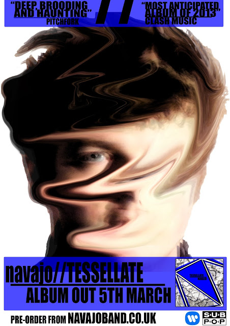
The original image of sam is exactly the same, however I went a different way about the edit of Sam. I always wished to distort the features of Sam (see research & planning for advert auxillary texts) as seen in the blurred, 'ghosting' effect of Sam's face in the original draft. This text however completely distorts Sam's face, yet not too exsessively that he is completely unidentifyable - the audiance still need to see it is the same person from the music video on the advert. The darkness of Sam's face also allowed for a colourful backround which would reinforce the visual presence that the darkened image thart Sam's face had. This would be ideal for attracting the audiances attention to the funimental poiunt of the advert; to see the actor/band members face. Further editing and the addition of graphics to the image reuslted in this:
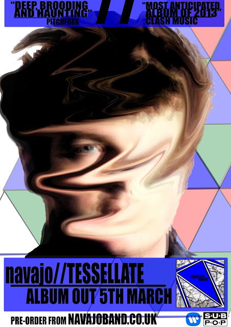
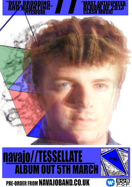
Comparing my final advert and the original draft, there is a significant obvious development in the images. The tesselation pattern -as discussed in the 'Magazine Page Advert' post previously - has relevence to the song and the whole thematic underpinning of the song which relates to the concept of the 'love triangle'. The geometric triangles also enhance the image as suspected, as well as ridding the blank whiteness of the original advert. I did however wish to keep a small fraction of white on the page rather than saturate the page with colourful triangles which would look bland and repetitive, contradiciting the attractive visual purpose of the advert.

The magazine that I used the content page of is 'The Fly', a free music magazine published by HMV's owners MAMA Group.The Fly is interestingly only an A5 sized magazine, for convenience sakes. The magazine has no real set genre, yet predominantly reviews and promotes new music of all varieties. Researching into costs of publication for advertisement concluded that to position this advert on the inside cover of the magazine would cost £4,000. Alternatively, a full page advertisement inside the magazine, rather on the inside cover would cost £3,000. I chose the more expensive option as this would guarantee attention: everybody will look at the inside cover, yet some magazine readers are simply 'flickers', especially when the magazine, such as The Fly, is free. With this in mind, the 'flickers' will look at the content page to see the content that they only wish to see and avoiding other music news they do not care about and still absorb my advertisement. This price is relatively cheap, considering the next cheapest value for an inside page advert is £6,000 from Clash magazine.
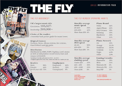
This is The Fly's media demographic information. With a readership of 500,000 (half a million!), the magazine is a fairly popular magazine. I put this down due to the easy accessibility to the magazine as it is a free magazine and a largely distributed magazine. These figures show that almost three-quarters of readers are 18-35, a demographic of which my selected audience. These figures also show that almost one-third of readers are student. I thought that a free magazine would be ideal for students, thus another valid reason for advertisement placement in this magazine.


(Shoot with Sam , a set on Flickr.)
These are some of the images that I was to initially use for my two auxiliary texts. The first four images of this set show the DIY backdrop; a big sheet draped over curtain rails, which actually worked rather effectively. I also used my personal spotlight to enhance the lighting of the shoot so that the images would become much more defined and clearer, a better quality for manipulation to make an advert or digipak. After taking the shots, I had to decide upon which image would be ideal to use for manipulation and editing and I decided upon this one to edit:
 I chose this image because Sam is not looking directly at the camera, yet looking in the general direction of the camera. This evokes an idea that Sam is ignoring or looking past the audience, retaining within the diegesis of the video and this advert; breaking realism can undermine the advert or look too 'cheesy', trying too had to connect with the audience. Additionally, the light on Sam's face is even and doesn't have too many shadows obstructing his facial features. One problematic, yet minor feature of this image is the red eye effect created on Sam's eyes due to the conflicting light from the flash and from the lamp i used. This was, fortunately, easily deleted with use of the Red-eye Removal Tool on Photoshop. The framing, however, is slightly obscured, with Sam only partially filling the frame, yet I always had the intention of only using Sam's outline: the purpose of the white backdrop made editing and cutting Sam from the fame much easier, as well as giving a reflective surface to shine light back on Sam. This would then make it an ideal image to place on the page to create an advert. With consideration of mise-en-scene of the video, I retained the colour scheme of thorough blue colour, however, upon reflection, this was completely redundant anyway as I only used the facial shot of Sam; I should have just taken a clse up of Sam's face with lighting on Sam's face, where I would not have needed to zoom and enhance the face cut out I did on Photoshop which actually reduces the quality of the image.
 Research provided a basis for a successful final product I beleive, yet obviously with some pit-falls. Initially, strucutring a first draft of the advert created using the textures considered for the digipak.

The image was too white, with too much blank space; which did on conform to the conventional display of a magazine advert which have the purpose to utilise page space and catch the readers eye; which I felt this original draft did not. However, I did wish to transfer the traingular shapes, to create a true tessellation pattern. This would fill the empty space on the page and create a more colourful and attention provoking text. Additionally, the opacity and light exposure/contrast on Sam's face after editing and placement on the page was too light, creating an almost blurred effect which I did not want; I only intended to layer the image, duplicated upon another. The syntax of the advert and the graphological placement of each banner (seen at bottom and top of the advert) was satisfactory and I thought no need to alter this structure.
This is an example of how initial drafting is ideal when creating a visual text, where I can easily reflect upon something I dont think satisfactory and re-do the text or make some sort of alterations to the text. With all the self-critisism I gave myself for my first advert; as well as some from peers who have told me about the adverts 'blankness', I could make ammendments to improve this speicfic auxiliary text to accompany my music video.
The process I went through to ammend my initial advert was still using the structure of the draft, yet visually make the advert more appealing to the audiance. My main objective was to give the addition of colour in the image and make Sam's face more prominent in the image, thus editing to darken this image. I disregarded the idea to use textures for my second, ammended peice due to the bland black white and grey colours and instead used the four triangle tesselation of the original draft to enhance cololur fo the advert and fill space. This would contrast well with the darker edit of Sam's face that I had manipulated on Photoshop. Here is the template of Sam's face that I used, then elaborated upon:

The original image of sam is exactly the same, however I went a different way about the edit of Sam. I always wished to distort the features of Sam (see research & planning for advert auxillary texts) as seen in the blurred, 'ghosting' effect of Sam's face in the original draft. This text however completely distorts Sam's face, yet not too exsessively that he is completely unidentifyable - the audiance still need to see it is the same person from the music video on the advert. The darkness of Sam's face also allowed for a colourful backround which would reinforce the visual presence that the darkened image thart Sam's face had. This would be ideal for attracting the audiances attention to the funimental poiunt of the advert; to see the actor/band members face. Further editing and the addition of graphics to the image reuslted in this:

Comparing my final advert and the original draft, there is a significant obvious development in the images. The tesselation pattern -as discussed in the 'Magazine Page Advert' post previously - has relevence to the song and the whole thematic underpinning of the song which relates to the concept of the 'love triangle'. The geometric triangles also enhance the image as suspected, as well as ridding the blank whiteness of the original advert. I did however wish to keep a small fraction of white on the page rather than saturate the page with colourful triangles which would look bland and repetitive, contradiciting the attractive visual purpose of the advert.
Overall, this advert personally grasps the attention of the audiance with a clear purpose done through the large font text at the bottom of the advert, =giving the audiance a message of release date and the offer to pre-order the album seen at the very bottom of the page. The visual aspect of the advert some may find slightly confusing or nihilistic, yet adiances who simply look at the advert and move on in the magazine may just appreciate the brightly coloured visual style, rather than be critical of the deeper meaning of the images and advert.
Magazine Advert: Integrated Into A Media Text
This is my album release poster placed beside the content page of existing music magazine content page, The Fly from Febuary 2013:

I did research into the conventional placement of advertisements and album release posters in music magazines and discovered that the two most prominent placements were the inside page of the front cover (as seen above) and the very back page of the magazine. I decided that placement next to the content page would be most suitable, thus using Photoshop I placed the content page and the advert next to one another.
The magazine that I used the content page of is 'The Fly', a free music magazine published by HMV's owners MAMA Group.The Fly is interestingly only an A5 sized magazine, for convenience sakes. The magazine has no real set genre, yet predominantly reviews and promotes new music of all varieties. Researching into costs of publication for advertisement concluded that to position this advert on the inside cover of the magazine would cost £4,000. Alternatively, a full page advertisement inside the magazine, rather on the inside cover would cost £3,000. I chose the more expensive option as this would guarantee attention: everybody will look at the inside cover, yet some magazine readers are simply 'flickers', especially when the magazine, such as The Fly, is free. With this in mind, the 'flickers' will look at the content page to see the content that they only wish to see and avoiding other music news they do not care about and still absorb my advertisement. This price is relatively cheap, considering the next cheapest value for an inside page advert is £6,000 from Clash magazine.

This is The Fly's media demographic information. With a readership of 500,000 (half a million!), the magazine is a fairly popular magazine. I put this down due to the easy accessibility to the magazine as it is a free magazine and a largely distributed magazine. These figures show that almost three-quarters of readers are 18-35, a demographic of which my selected audience. These figures also show that almost one-third of readers are student. I thought that a free magazine would be ideal for students, thus another valid reason for advertisement placement in this magazine.
No comments:
Post a Comment